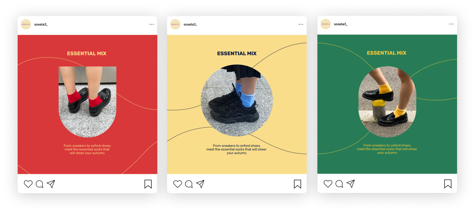
Soseta3 Rebranding
The goal was to adopt a bolder and more vibrant look, one that would captivate existing audiences while attracting new ones.
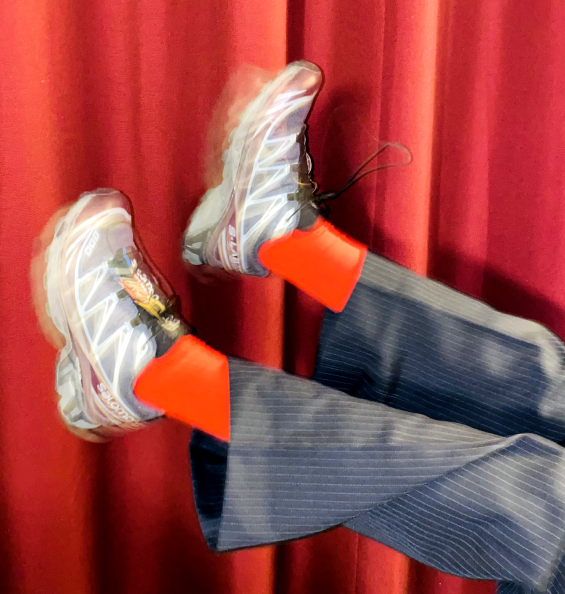
The heart of Soseta 3's rebranding lies in its bold and vibrant approach. The visual identity bursts with a dynamic color palette, vibrant forms, and captivating motion assets, ensuring an eye-catching experience for all who encounter it.
The revamped visual language of Soseta 3 symbolize an embrace of change and a forward-looking approach.
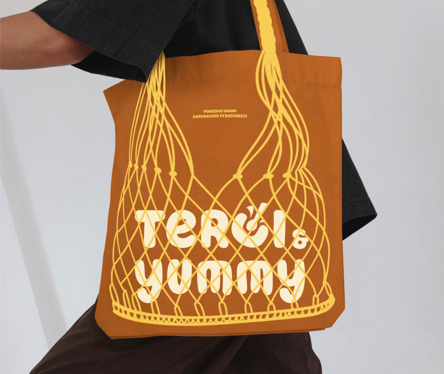
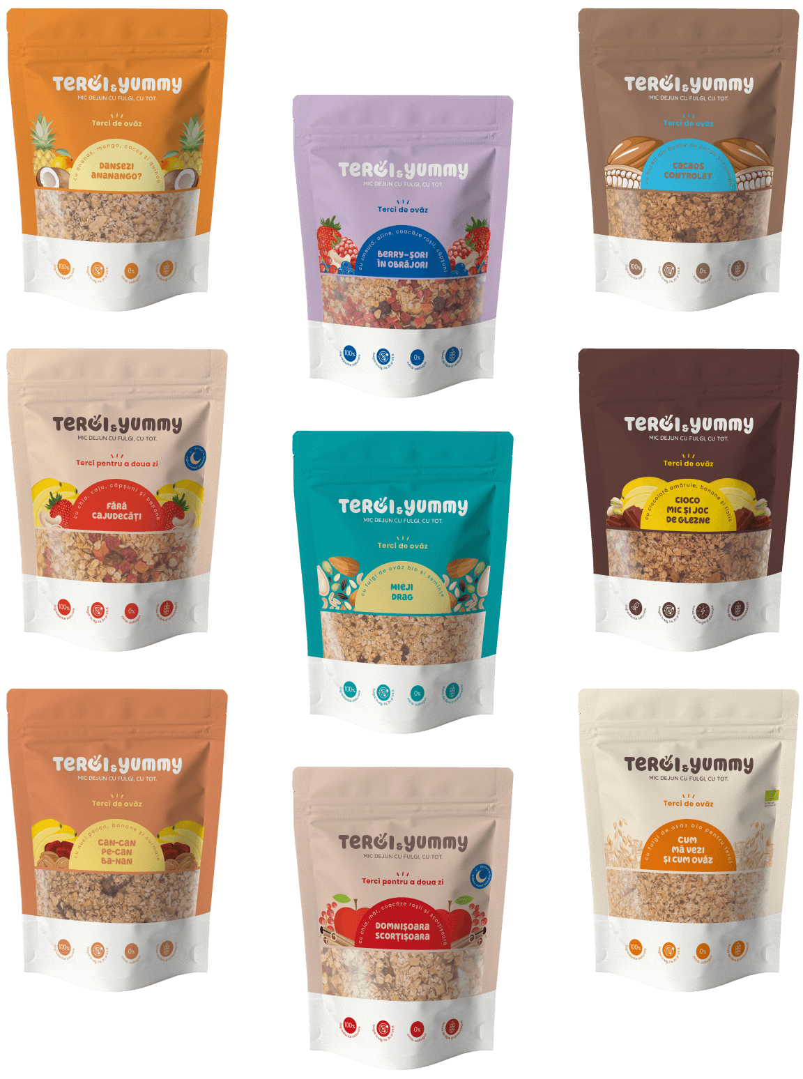
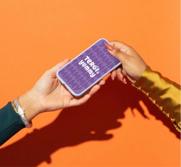
Terci & Yummy Packaging Design
Bringing some colorful vibes to the delicious oatmeal brand Terci&Yummy. Made purely from organic oat flakes and free of any added sugar, it offers long-lasting satisfaction and nourishment throughout the day.
The core of the branding are the pattern composed of the “yummy” word and the half circle shape which symbolizes the perfect moment to savor oatmeal - at sunrise.
Terci&Yummy's packaging and visual language celebrate the natural vibrancy found in each flavorful variety.
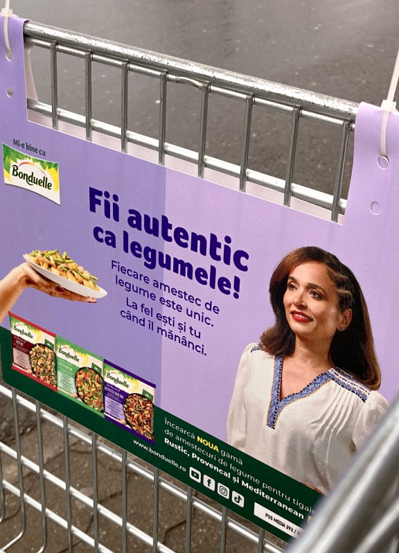
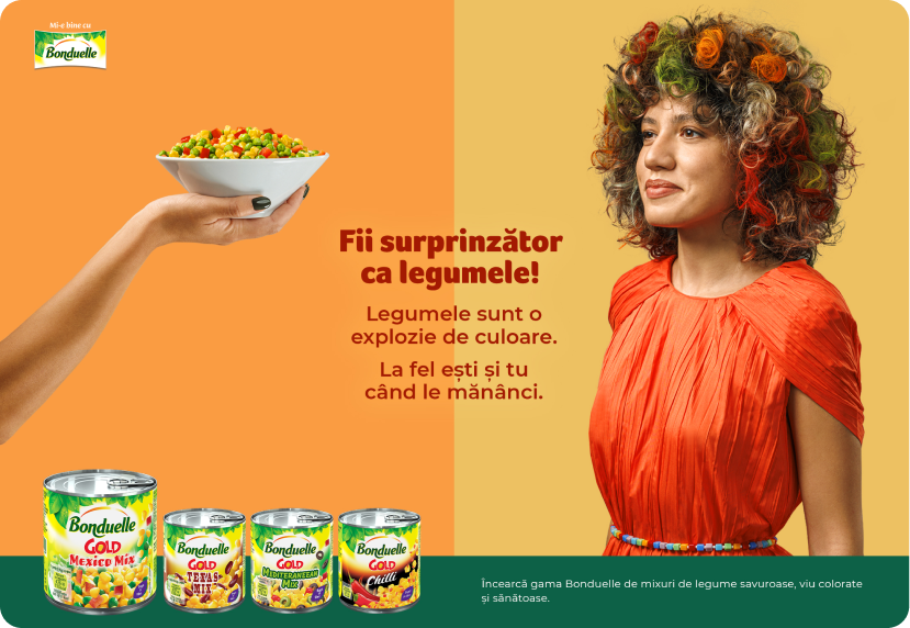
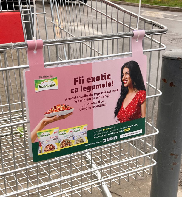
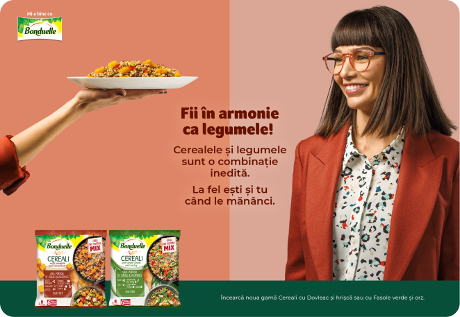
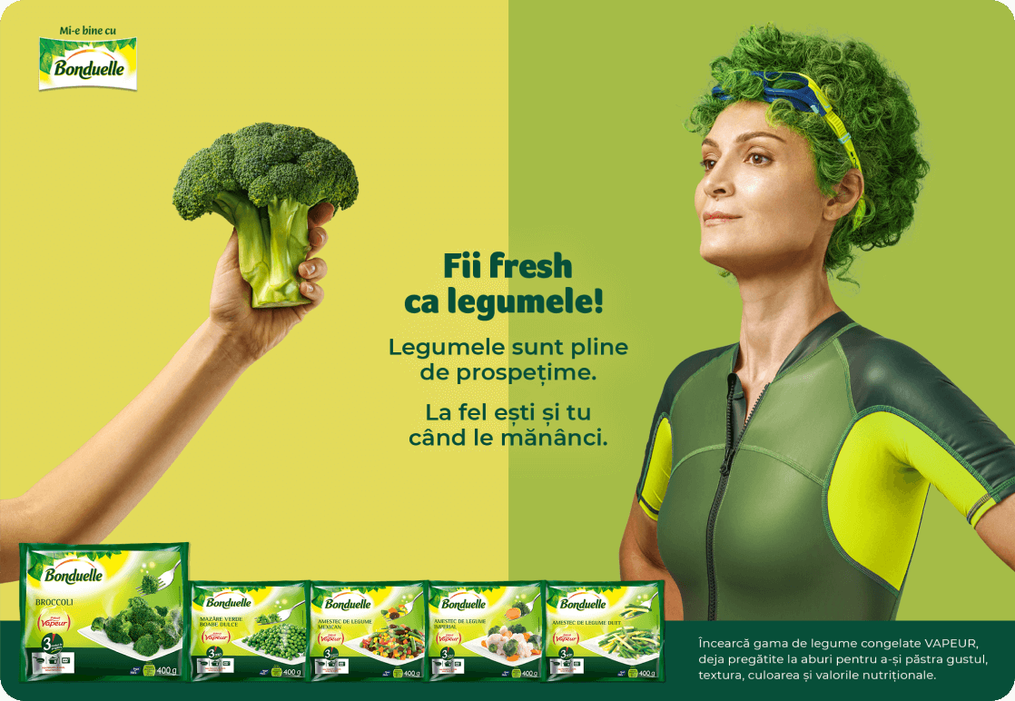
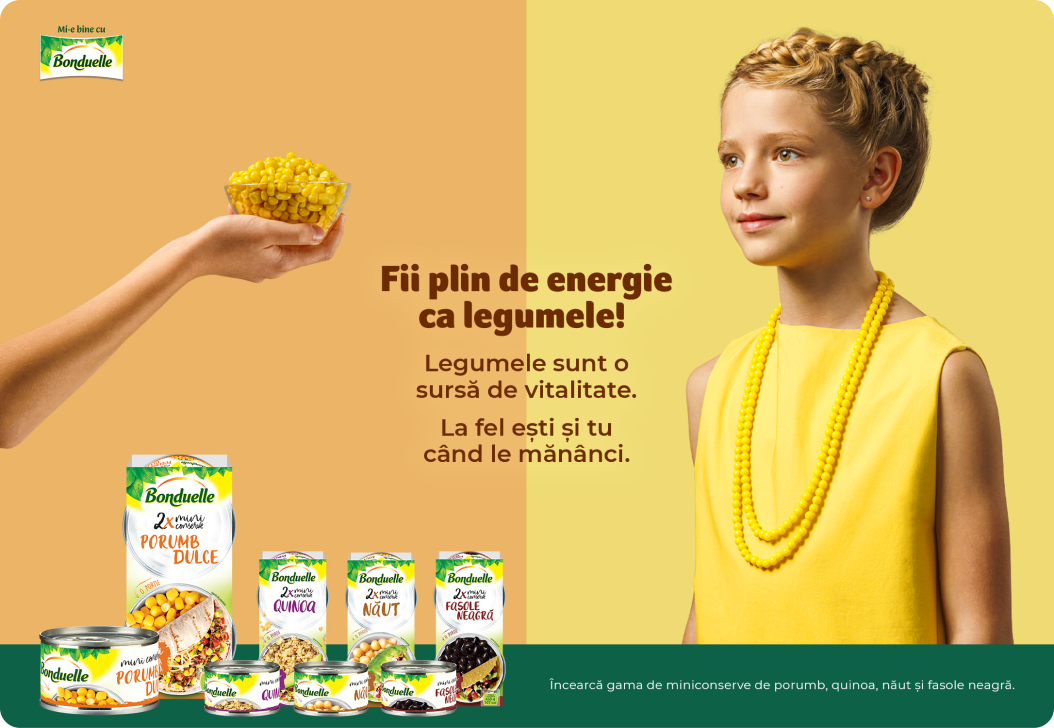
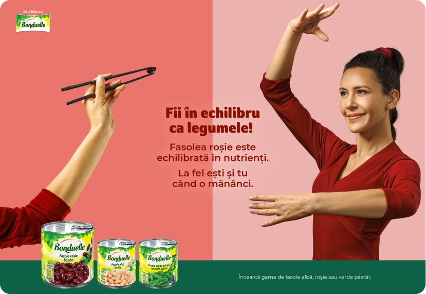
Bonduelle KeyVisual Campaign
The heart of the new communication platform "Be Like a Veggie" was the creative direction. I wanted the visuals to reflect the vibrant and positive impact of veggies on our well-being. The aim was to strike a balance between creativity and simplicity, ensuring clarity of message.
Through the casting and art direction, I revealed the best in each persona during the photoshoots, capturing the essence of each vegetable in a lively way.
The visuals are a burst of color, just like the variety of veggies offered by Bonduelle. By mirroring the veggies in the personas I encouraged the viewers to see themselves adopting healthier habits and more veggies in their lives.
Portfolio Website
Mamady Condé is a versatile talent, renowned for his skills as a director, writer, and producer, with notable works like "The Gold Coast"(2021), "Puzzled" (2014), and "Nike Blueprint" (2023).
The heart of Mamady Condé's portfolio is its simplicity. I aimed to let the video content speak for itself without distractions. A clean interface with a minimalistic layout puts the focus squarely on his exceptional work.
A captivating feature of the website is the looping, changing colored background with a subtle touch of static noise. This dynamic backdrop adds a touch of intrigue and artistry to the overall presentation.
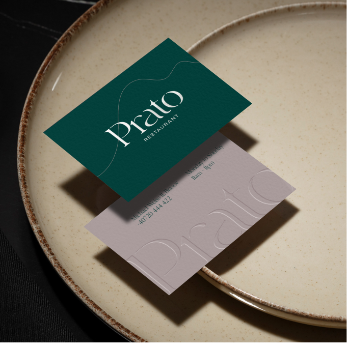
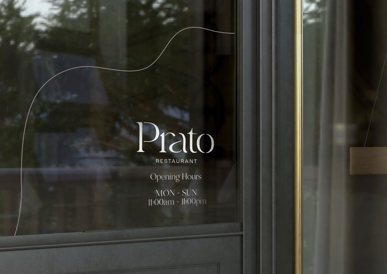
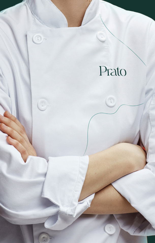
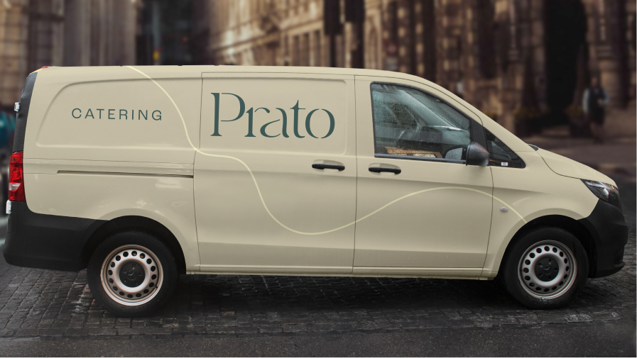
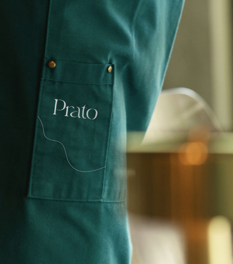
Prato Restaurant Rebranding
Genuine Italian ingredients, rich flavors, and a strong sense of community are Prato’s three key commitments. The rebrand celebrates Prato Restaurant as a big family, bringing together authentic tastes, award-winning chefs, and culinary enthusiasts alike. The new logo is mixing a classy title case lettering with curved lines and thickness fluctuation giving Prato’s logo refinement and sophistication.
Currently available for freelance bookings internationally.